
I really enjoy the design that is incorporated into Esquire magazine. I love this cover and the way the text/illustration is on top of the image.
I really enjoy the design that is incorporated into Esquire magazine. I love this cover and the way the text/illustration is on top of the image.
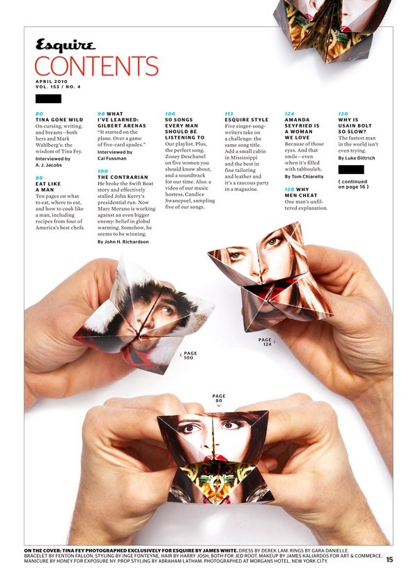
I was having the hardest time trying to figure out what to do for my music packaging! i came across this table of contents page from Esquire magazine and I loved the way they used the fortune tellers that I created as a kid in a totally different way.
This bird is awesome! I love the colors that have been incorporated as well as the geographic elements in the background. “Put a bird on it!”
A little fellow I drew up over Easter… Didnt have my Wacom board so just did it with the pen tool in Illustrator CC and some Photoshop blend-mode craziness (too much in hindsight).
Mad RSI happening in my wrist right now! 🙂

My co-worker sent me this video yesterday and I love it!. It portrays the beauty of typography when used on paper and on screen. It shows the evolution of the typography in cinema as well.

Biodegradable packaging for a biodegradable lightbulb

I love the color scheme that is incorporated into this bright, fun design. It shows that Capital Cities has a fun personality which is reflected in their music.

The package design for this product is so creative! The product is tea and when unwrapped…still in the shape of the tee pee.
I captured this photo while walking the streets of Minnesota. It was such a beautiful, sunny day so there was a pretty reflection on these aqua blue windows that I could not pass up!

I thought this was the coolest bike rack…I would park my bike there every day if I went to the University of Minnesota.

While walking through campus at the University of Minnesota, we came across this lovely tree that had layers upon layers of shoes hanging from every branch. I thought this was interesting and I am intrigued to find out the story behind it.

